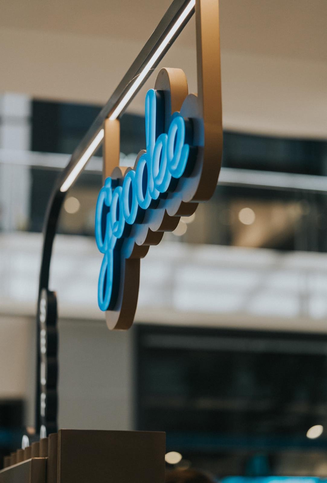
Goodee (Interior)
Branding | Collateral | Interior
Make every day
a
‘Goodee Day!’
Client
Grouse PTY LTD
Sector
Quick Service Restaurant
Fast Casual Dining
Cafe
Franchise
Services
Interior Concept
3D Renders
Construction Documentation
Signage
Singkat
After the success of their Carnegie cafe, Grouse — the clients — approached BrandWorks to open a new kiosk in Chadstone. They sought a refreshing interior and brand that exuded the same values as their flagship store. Fresh, healthy, and vibrant, the contemporary kiosk focused on acai, smoothie bowls, and juices, offering a place where people can enjoy healthy and delicious choices. The aim was to establish a recognisable link between Grouse Carnegie and the Chadstone kiosk while bringing a contemporary new spin on the design. Thus, "Goodee, powered by Grouse" was born, providing an exciting new extension of the Grouse legacy.
Approach
Kiosk design requires a delicate balance of brand recognition threaded through a robust and refined aesthetic. With limited space to catch people's attention, the challenge was making a statement that does not impede sightlines to adjoining tenancies. Inspired by Goodee's fresh offerings and the abundance and fertility found in traditional greenhouses, the design team at BrandWorks looked at architectural silhouettes and finishes to create a robust and 'powered by' backdrop for Goodee to make its mark.
Outcome
Brick, timber, and micro-cement—these natural and authentic finishes wrap the architectural silhouette of Goodee, exuding values of genuineness. The aim is to embody the essence of fresh, nurturing food through its hardwearing materials and earthy yet energetic colours.
Brand anchoring is threaded through the illuminated vertical frames, powder-coated in Goodee's iconic teal green, with pops of acai purple, sky blue, and warm yellows on the custom-illustrated perforated panels. The upper two-thirds of the kiosk facade is wrapped in fluted micro-cement, giving a sense of suspended lightness to the otherwise solid design.
Taking advantage of the full-round kiosk, all the corners were maximised to its customer journey potential. From ordering and pick-up areas to standing and sitting dining areas, as well as being mindful of creating the invisible sightline boundaries of the back-of-house preparation area. The layout was being optimised to operate as efficiently and conveniently as possible for the customers and the staff.
Indulge in healthy and delicious choices in a space designed for a health-conscious community and elevated by nature finesse.


